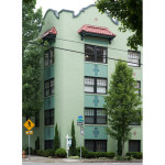
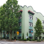
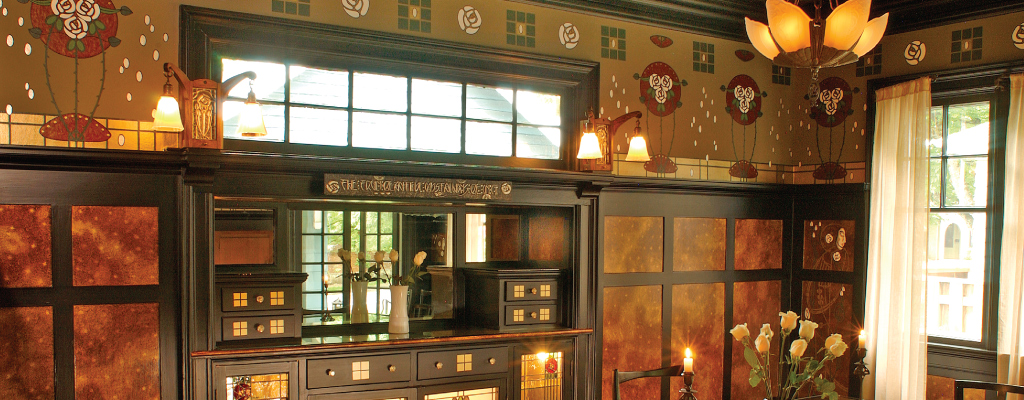
Condos, Churches, Schools & Commercial
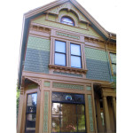
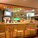
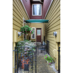
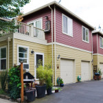
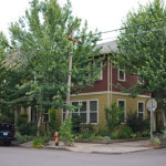
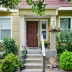
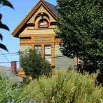
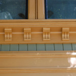
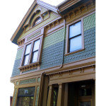
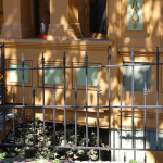
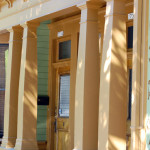
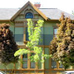
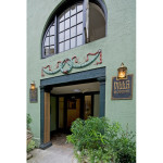
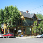
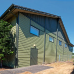
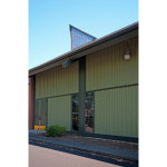
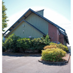
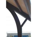
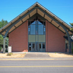
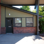
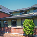
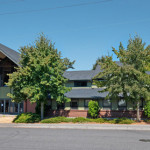
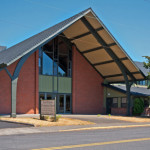
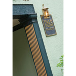
Outside of how they are used, large-scale public buildings and commercial buildings are no different than houses – they still need to look good in their environment. Sensitivity to the landscape and the relationship of the building to neighboring structures remains essential. Our viewpoint and approach to handling color is just as carefully considered when working with these more challenging structures. When working with the buildings shown here, it was essential for us to understand the greater context of building’s use and the personalities of the many inhabitants. Here we chose colors to meet a variety of needs: honoring history, respecting neighbors, satisfying the tastes of many stakeholders, even inspiring students.


The Villa Florence (detail)
The entry to the 1920’s Mission Revival/Art Deco Villa Florence condominiums shows the wonderful raised ornamental wreath and ribbon design and the well-appointed arched casement windows. We worked with a committee of 22 owners to develop colors that would please everyone living in this magnificent historic building in downtown Portland OR. The colors set off the building’s Art Deco brass plaques, and a polychrome scheme calls attention to the building’s elegant ornamentation.

The Villa Florence
The Villa Florence is a Mission Revival style building that has numerous Art Deco influences on the interior. It is situated on a highly visible corner active with both pedestrian and car traffic. We developed multiple color stories to meet the various wishes of the condo’s owners, and to work with the building’s original polychrome inlaid ceramic tiles. The owners ultimately chose this Art Deco period scheme that highlights the building’s architectural details and surface textures. Once a pale shade of pink, this building now has new vitality befitting of its urban downtown setting.

The Villa Florence
Multi-planed stucco creates panels of differing levels that frame original inlaid polychrome tiles. The new colors accent the building’s different layers and draws attention to its inviting and original double- hung windows.

The Villa Florence (detail)
Square, cast concrete half-columns frame the entry court to the Villa Florence. We called out the fluting on the columns to complement other ornamentation on the building, and to direct the eye to the quaint entryway of this historic gem.

First Orthodox Presbyterian Church
Architect designed, the thoughtful composition of this lovely Mid-century church was in need of attention after years of use by its dedicated congregation. We were called in to select colors that would complement the building, and call out its handsome architectural details. We were also asked to redesign the architectural details of a 1980’s addition that looked tacked onto the building, and to address the restoration of the stained glass featured on the “lantern” projecting from the roof of the building.
Learn more about the stained-glass project on the Stained Glass page in our Design, Decorating, & Restoration Consultation section.

First Orthodox Presbyterian Church
In selecting the colors for the church, it was important to the congregation that the building work with the landscape, “fit in” with the church’s residential neighborhood, and “not get lost” to passersby. The new color scheme calls out to viewers at the same time it fits neatly into the church’s lovely landscape.

First Orthodox Presbyterian Church
The 1980’s addition starkly contrasted with the original historic structure. We designed new exterior trim details that were added to the addition. With new colors and new trim, the 1980’s addition fits better with the Mid-Century church.

First Orthodox Presbyterian Church (detail)
This image, at the entrance to the addition, shows a detail of the new, interlinked trim elements we designed to complement the original church.

First Orthodox Presbyterian Church
Using color to call out the different elements of the church shows off its awesome architectural details!

First Orthodox Presbyterian Church (detail)
The church’s massive glulam arches were given new emphasis with the incorporation of a bold trim.

First Orthodox Presbyterian Church
This view shows the contiguous linear trim details of the original church, and a view of the stained glass we helped to restore on the church’s rooftop “lantern”.

First Orthodox Presbyterian Church
The back of the church’s addition was given new life with the introduction of the new colors. Before, the building’s details were lost in a solid field of bland beige.

Corkish Apartments
We were hired to select the colors for the incredible historic Corkish Apartment building (now condos) in Portland, OR. The 1890’s Queen Anne style structure, listed on the National Register of Historic Places, was built as apartments in the late Victorian period, and has all of the charming details to be found in Aesthetic Movement architecture.

Corkish Apartments
The building’s façade is divided in a tri-partite scheme allowing for multiple levels of color. There are also a lot of wonderful Aesthetic
style gingerbread trim that allowed for a more playful use of color to bring out the structure’s delightful details.

Corkish Apartments
The colors were designed to harmonize with the surrounding landscape, and to work with both the period of the home, and with the history of this vital Victorian neighborhood.

Corkish Apartments (detail)
The application of multiple colors highlights the interesting shingle courses found on the building, while color integrity on the trim allows all of the gingerbread to be highlighted naturally through the use of light and shadow.

Hancock Street Townhouses
A new construction condominium in Portland’s Irvington neighborhood needed the right colors to help make it fit into this important historic community. We also designed new columns and other trim details to replace poorly proportioned ones on the building’s many entry porches.

Hancock Street Townhouses (detail)
The original porch columns were typical of new construction: out of proportion and missing historic detailing. We designed the new columns, pictured here, to replace ones that looked like fence posts, and brought to them the kind of substantiality required of Arts & Crafts inspired architecture.

Hancock Street Townhouses
The townhouse’s residents wanted the building to stand out and complement the surrounding landscape with its tree-lined streets.

Hancock Street Townhouses
Where the garages and back courtyards are located, the new scheme – inspired by the colors of autumn – makes the back of the condo-complex look as attractive as the front façade.

Hancock Street Townhouses (detail)
The cute and intimate setting of the back courtyards were given new life with the addition of vivid colors that are a far cry from the building’s former cold grey scheme.