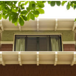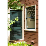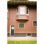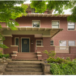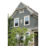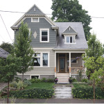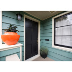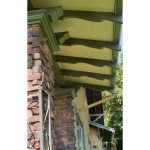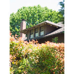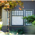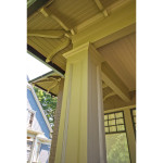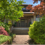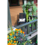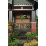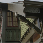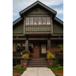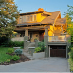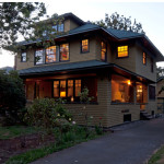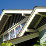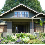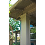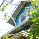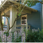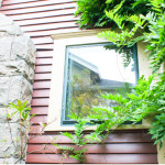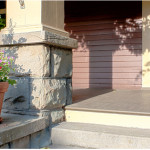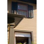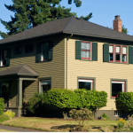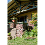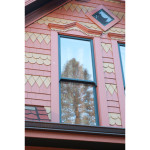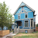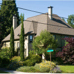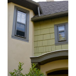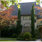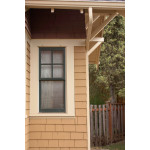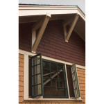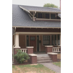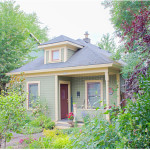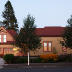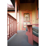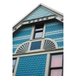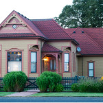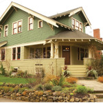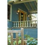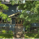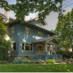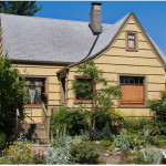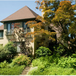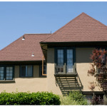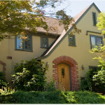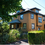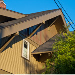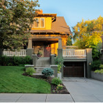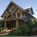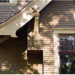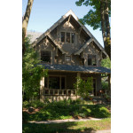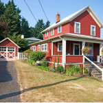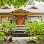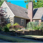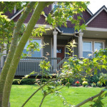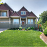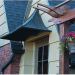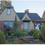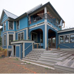
Exterior Color Consultation
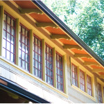
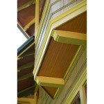
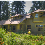
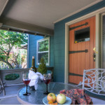
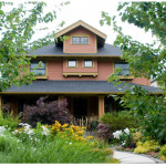
Colors are innately emotive. The colors of a home evoke moods and inspire emotional responses in people. More importantly, exterior colors say something about you, and if you live in a period home, the colors you choose say something about how you feel about history. The effects of color are deeply personal, and we take care to create a palette that is designed for you and expresses the atmosphere you want to convey with your home.
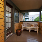
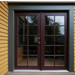
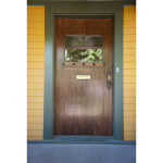
Sensitivity to the landscape, the surrounding environment and other homes & buildings is very important when choosing exterior colors. When working on a vintage home, finding the delicate balance between expressing your personality while being true to history is key. House colors should be unique to you and your home, they say something about you, therefore, choosing colors for your home’s exterior is one of the most important decisions you can make.